Brustin icon tutorial!
Aug. 14th, 2005 08:58 pmI conducted a poll recently on my journal where I asked my flist to vote for what icon they'd want me to do a tutorial of. In the end, it was a three way tie, allowing me to choose one, so I chose the one that I felt had the most merit as a technique, rather than just as a specific icon. So! This is my first tutorial, I hope it's helpful at least in some small way :)
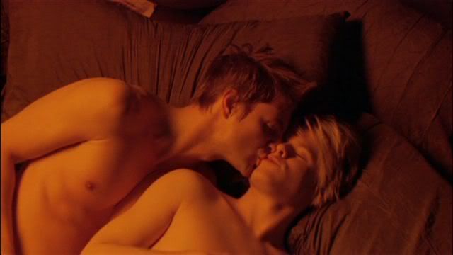
We're going to be going from THIS to this:
Step 1
Crop the image down to 100x100.

Step 2
Sharpen once.

Step 3
Duplicate the base layer and set this copy to Screen at 76% opacity.

Step 4
Duplicate the Screen layer and leave the settings. Now, you need to use a combination of the magnetic lasso and the lasso tools to carefully select the outline of the two boys. It's helpful to zoom in a lot, to distinguish where they end and the pillow begins. Also remove the area between them, under Brian's chin, from the selection, so only the boys are selected. Now, with this area selected, go to Layer->Add Layer Mask->Reveal selection. The pillows should darken as that part of the layer is masked.

Step 5
Duplicate the masked layer so that you now have two Screened layers with the mask. Brian and Justin should stand out from the background. Don't worry if the lines around them look a little sharp, we'll fix that with some colors on top of them.

Step 6
Now there are two ways to do this step. They're both equally easy, so I'll just tell you the one I used. create a new layer (Shift+ctrl+N or go to Layer->New->Layer) and fill it with black (color #000000). Right click on the mask of the previous layer and choose "Set Selection to Layer Mask". Now you can either create another mask the same way as we did before, or simply press the del key on your keyboard (with the black layer active) to remove the black from over the boys. Set the layer to Color at 100%.
 -->
--> 
Step 7
Now we want to dull down that intense orange color that the boys are. The complementary color of orange is blue, so let's true blue, shall we? (I didn't think about that when I did it, I don't think, but I think that's why it works ^_^) click the little black and white circle in the layers window and choose "Gradient...". Make the gradient a black to blue fade, the blue being #62788D. In the gradient fill layer, set the angle to -135, or whatever puts the blue in the same corner as the boys. Set this layer to Color at 45% opacity.
 -->
--> 
Step 8
I need a color layer to pull the whole icon together, so I fiddled with different colors and ended up with a dark green. Go to the black and white circle again, select "Solid Color...", and choose #114900, a dark green. Set this layer to Soft Light at 69% opacity.
 -->
--> 
Step 9
Now for some decoration. I started with a border brush by![[livejournal.com profile]](https://www.dreamwidth.org/img/external/lj-userinfo.gif) daughterofsnape. Use the brush in a white color on a new layer on top of everything else. Then use an eraser to erase the part of the border that is on top of the boys, so now it looks like its going under them. Set the layer to Difference at 100% opacity.
daughterofsnape. Use the brush in a white color on a new layer on top of everything else. Then use an eraser to erase the part of the border that is on top of the boys, so now it looks like its going under them. Set the layer to Difference at 100% opacity.
 -->
--> 
Step 10
Another brush by_joni. Again apply this one in white to another new layer. Erase the part on the left until only the leaf... thing... remains. Set the layer to Linear Dodge at 39% opacity.
 -->
--> 
Step 11
For the large text, the font is Sylfaen. The first row is size 9, text "this is" and the second row is size 10, "M A G I C" Then I just added two lines of tiny text, Sylfaen, size 1, spacing 3 pt. And you have your final product!
Please do not copy this tutorial directly. Learn from my techniques and use them to create your own unique work. Please feel free to tell me what you think, and I'd love to see what you do with this! Enjoy :)
We're going to be going from THIS to this:
Step 1
Crop the image down to 100x100.
Step 2
Sharpen once.
Step 3
Duplicate the base layer and set this copy to Screen at 76% opacity.
Step 4
Duplicate the Screen layer and leave the settings. Now, you need to use a combination of the magnetic lasso and the lasso tools to carefully select the outline of the two boys. It's helpful to zoom in a lot, to distinguish where they end and the pillow begins. Also remove the area between them, under Brian's chin, from the selection, so only the boys are selected. Now, with this area selected, go to Layer->Add Layer Mask->Reveal selection. The pillows should darken as that part of the layer is masked.
Step 5
Duplicate the masked layer so that you now have two Screened layers with the mask. Brian and Justin should stand out from the background. Don't worry if the lines around them look a little sharp, we'll fix that with some colors on top of them.
Step 6
Now there are two ways to do this step. They're both equally easy, so I'll just tell you the one I used. create a new layer (Shift+ctrl+N or go to Layer->New->Layer) and fill it with black (color #000000). Right click on the mask of the previous layer and choose "Set Selection to Layer Mask". Now you can either create another mask the same way as we did before, or simply press the del key on your keyboard (with the black layer active) to remove the black from over the boys. Set the layer to Color at 100%.
--> Step 7
Now we want to dull down that intense orange color that the boys are. The complementary color of orange is blue, so let's true blue, shall we? (I didn't think about that when I did it, I don't think, but I think that's why it works ^_^) click the little black and white circle in the layers window and choose "Gradient...". Make the gradient a black to blue fade, the blue being #62788D. In the gradient fill layer, set the angle to -135, or whatever puts the blue in the same corner as the boys. Set this layer to Color at 45% opacity.
--> Step 8
I need a color layer to pull the whole icon together, so I fiddled with different colors and ended up with a dark green. Go to the black and white circle again, select "Solid Color...", and choose #114900, a dark green. Set this layer to Soft Light at 69% opacity.
--> Step 9
Now for some decoration. I started with a border brush by
--> Step 10
Another brush by
--> Step 11
For the large text, the font is Sylfaen. The first row is size 9, text "this is" and the second row is size 10, "M A G I C" Then I just added two lines of tiny text, Sylfaen, size 1, spacing 3 pt. And you have your final product!
Please do not copy this tutorial directly. Learn from my techniques and use them to create your own unique work. Please feel free to tell me what you think, and I'd love to see what you do with this! Enjoy :)
no subject
Date: 2005-08-15 02:58 am (UTC)no subject
Date: 2005-08-15 03:03 am (UTC)I did write a sequel script for a class in school, though. It even included acceptable levels of homoeroticism. My teacher loved it, despite being the son of a Minister. He gets points for giving me wonderful marks on it. :-P